Interior Design Trends: How to Use the 2020 Color of the Year in Your Home!
Bringing you the 2020 Color of the Year from our favorite color experts, Sherwin-Williams, Benjamin Moore, and Pantone. Each has revealed their 2020 Color of the Year colors and trends for the new decade and we couldn’t be more excited to see where these beauties take us. Keep reading to find out the newest color trends, how they can be used, and how to enhance the beauty in your home with a fresh start in this new year!
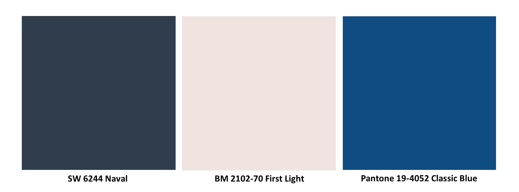
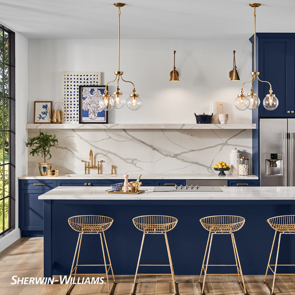
Sherwin-Williams: SW 6244 Naval 2020 Color of the Year
Is navy the new gray? We’re not kicking gray out anytime soon, but it’s great to think of a bold, yet subdued color as a ‘neutral’ in design.
We’ve already begun to use navy in our designs and it has absolutely blossomed. It is such a classic color to bring into any design in a multitude of different facets. Sherwin-Williams’ 2020 Color of the Year SW 6244 Naval brings a soft, yet striking contrast to a space while also providing a little life with deep and warm sapphire tones. Sherwin-Williams’ description of biophilia in design is spot on, “…-our intrinsic need as humans to interact with nature. The inclusion of live greenery and mineral-based materials like marble, allow us to create a natural sanctuary that encourages rejuvenation in your everyday life. It’s about slowing down to appreciate the beauty in nature and how you can bring it indoors.” We couldn’t agree more.
Colors to Pair with SW 6224 Naval:
Undoubtedly, a classic gold is a perfect color to pair with Sherwin-Williams’ 2020 Color of the Year. It lends a nod to the opulence of the Art Deco movement which coincidentally began 100 years ago, in 1920! Check out our recommendations for other types of colors that will accentuate the richness of SW 6224 Naval: SW 7006 Extra White, SW 7632 Modern Gray, SW 7660 Earl Gray, & SW 6384 Cut the Mustard. We currently have a project in motion utilizing a similar navy tone that we can’t wait to share with you!

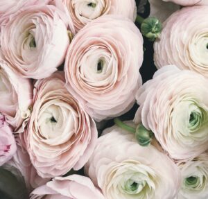
Benjamin Moore: 2102-70 First Light 2020 Color of the Year
A new year means time for a refresh. White has been our go-to refresh for a long time and will never go out of style, but it’s time to give that refresh some life.
Blush tones have been gently sweeping into design and fashion in the last few months…again. At first thought, this brings me back to the early 90s. Everything eventually enjoys a resurgence and now is the time for light rosy hues and soft blush pinks with Benjamin Moore’s 2020 Color of the Year 2102-70 First Light. For some, it may not be your room’s overall paint color but rather a great tone to sprinkle through a design in many different ways. As this 2020 Color of the Year is a more feminine color, it doesn’t mean that it can’t soften up a predominately masculine design. And, for a more feminine design, Benjamin Moore’s First Light is quite possibly the most perfect choice.
Colors to Pair with BM 2102-70 First Light:
With a nod to the early 90s pastel palette, we recommend using First Light to bring a delicate aspect to a bold or quiet design. Check out our recommendations for colors that will embrace the brightness of BM 2102-70 First Light: BM 2048-10 Sherwood Forest, BM 2102-40 Brown Teepee, BM 2122-70 Snow White, & BM 2123-30 Sea Star. Visit ‘The Lighthearted’ in our Portfolio to see versions of this beautiful hue in real life!
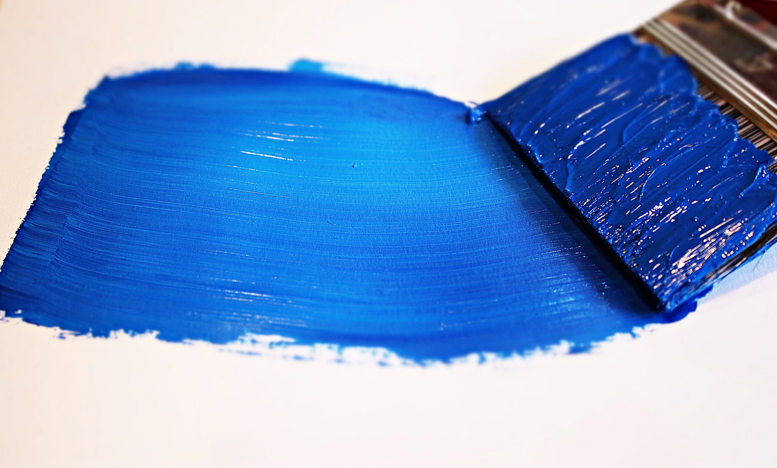
Pantone: 19-4052 Classic Blue 2020 Color of the Year
Can you say classic again? Reflecting the perfect amount of saturation, this timeless approach to a blue hue will live on forever.
Pantone’s 2020 Color of the Year, Classic Blue, brings us a sense of peace in this busy world with its calming neutral-like capabilities. Coming from the basic color wheel, this classic blue lets you jump in and float into tranquil thoughts. As you let the feeling rush over you like the gentle brush of a calm water, you can see why blue makes you feel the way it does, time and time again. Leatrice Eiseman, Executive Director of the Pantone Color Institute, calls Pantone’s Classic Blue ‘dependable and solid.’ There are no two better words for such a Classic Blue as Pantone’s 2020 Color of the Year.
Colors to Pair with Pantone 19-4052 Classic Blue:
With a little more vibrancy, Pantone’s 2020 Color of the Year has a great range of coordinating colors to step outside of the gray and white box. Check out our recommendations for colors that will embrace the brightness of Pantone 19-4052 Classic Blue: PANTONE 18-1444 Tandori Spice, PANTONE 17-1341 Tawny Orange, PANTONE 11-0617 Transparent Yellow, & PANTONE 16-0235 Kiwi. Visit ‘The Speed Demon’ in our Portfolio to see versions of this classic hue in real life!
Minneapolis, St.Paul, and Minnetonka Interior Design Resource
You’ve now seen a glimpse into what the future of this new year holds with the 2020 Color of the Year from three of the top color influencing companies. Be bold and confident with notes of strict contrast or be light and simple with notes of soft blends. There is a color, or ten, out there for everyone so here’s to finding the perfect shade for your next design! We are available for color consultations too!
Che Bella Interiors specializes in professional, knowledgeable, and honest interior design services for homes across Minnetonka, Minneapolis, St. Paul, and the Twin Cities metro. With a process tailored to your wants and needs, we create spaces that become your new favorite spot!
Written by Stefanie from the Che Bella Team