Paris fashion week 2016, how will it translate to interior design?
You’ve heard time and time again that trends in interior fashion are often inspired by the fashion industry. As 2016 Paris Fashion Week comes to a close, you’ll see many images popping up on blogs and magazines reviewing the artistic clothing, new patterns/textures and inspiring fashion shows that Paris is known for. As interior designers we often wonder what will translate to interior fashion. And, what we will see in the future at our trade showrooms and markets. It’s always an exciting time as everyone likes to see something new and influential. This week Vogue has released a few images from the runway shows and we wanted to see how these fashion designers styles might relate to interiors throughout the country.
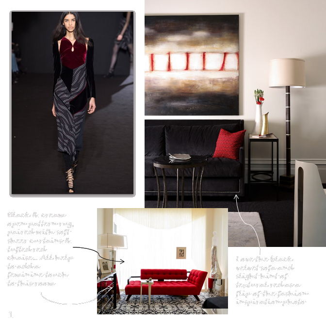
A feminine twist on red & black: While the red and black combination in interior design is nothing ‘new’ per say, I do like how Roland Mouret managed to make it feminine on the runway. Many times a strong black and red interior palette can feel masculine if too many of the surfaces have the same texture or sheen. The velvet burgundy fabric adds a softness against the pattern and the texture reflected in the model’s shoes makes for an interesting relief to the outfit. Within an interior setting you can see how these two images reflect a similar style.

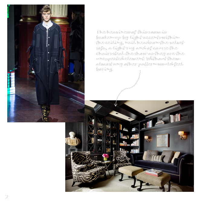
A dark neutral: While many people think of neutral to be a beige, greige or earth tone – a dark saturated blue or gray can become a neutral within your space just as easily. The Kenzo fashion line created a heavy neutral ensemble that gave relief by having a pop of the unexpected in their boots. I always think that every neutral room needs something to pop and take over as the star of the show. The interior image below is nearly a spot on reflection of the runway fashion spotted at the Kenzo fashion show this past week.

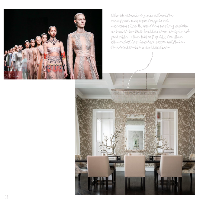
Light and ballerina inspired: Both of the palettes above were heavy in nature. You might be asking if anything about the fashion in Paris was on the lighter spectrum and indeed it was. A light blush tone was incorporated into much of the Valentino collection. While not everyone can pull off a blush tone in fashion – it can look wonderful in a home as a soft accent when paired with a darker or medium tone neutral. It can even appear very woodland or rustic chic as shown in the image below.

Sources: (1) Fashion photo: Kim Weston Arnold / Indigital.tv, interiors by Dillard Pierce Design Associates, Atlanta and Charles Pavarini III Design Associates, Inc | (2) Fashion photo: : Yannis Vlamos / Indigital.tv, interior by Design Line Construction, Inc., San Francisco | (3) Fashion photo: Alessandro Garofalo / Indigital.tv, interior by CDA Interior Design, Dallas


